Meeting room utilisation is the share of bookable room hours actually occupied, calculated as occupied room‑hours divided by total bookable room‑hours. The first move isn’t buying sensors. It’s running a one‑month audit comparing calendar bookings against real occupancy, because that single comparison usually exposes where the waste is hiding.
TL;DR:
- Running a one-month audit comparing calendar bookings with actual occupancy reveals hidden waste and exposes underused or oversized rooms.
- Four key metrics—utilisation rate, booking utilisation, no-show rate, and room size match—should be tracked to accurately assess meeting space efficiency.
- Combining booking, check-in, and sensor data, with privacy considerations, provides the clearest picture of true room usage and identifies the main sources of inefficiency.
- Most rapid gains in utilisation come from policy changes like auto-release, booking caps, and reconfiguring oversized rooms, rather than increasing space.
- A phased approach with pilot testing and clear ownership helps verify data accuracy and supports effective space reconfiguration without unnecessary building or large investments.
Table of Contents
- What meeting room utilisation actually measures
- The metrics that actually predict savings
- How do you actually measure room usage?
- What good utilisation actually looks like
- What the numbers are usually trying to tell you
- Fixing utilisation without adding a single square metre
- Running a pilot without overbuilding your tech stack
- What a practitioner’s audit usually finds
- Get expert help turning utilisation data into real savings
- Sources
- FAQ
What meeting room utilisation actually measures
Utilisation isn’t the same as occupancy, and mixing the two up leads managers to the wrong conclusions. Occupancy tells you a room had people in it at a given moment. Utilisation tells you what proportion of the room’s available hours were genuinely used for their intended purpose, and occupancy alone doesn’t reveal whether that space is fulfilling its collaborative job.
The formula is straightforward: occupied room‑hours ÷ bookable room‑hours over a set period, expressed as a percentage. A 10‑seat boardroom booked for eight hours a day but genuinely used for three is running at 37.5%, not 100%, no matter what the calendar says.
Booked and occupied are different states entirely:
- A room can be booked but empty (a no‑show or a habit of holding recurring slots “just in case”).
- A room can be occupied without ever being booked (someone grabs it for a quick call).
- A room can be booked correctly but oversized for who turns up.
Occupancy dashboards that only track presence miss all three failure modes, which is why relying on them alone tends to overstate how well space is actually working.
The metrics that actually predict savings
Four numbers matter more than any dashboard summary screen, and each one answers a different question.
- Utilisation rate — occupied hours ÷ bookable hours, the headline figure for any room or zone.
- Booking utilisation — booked hours ÷ bookable hours, which shows demand pressure regardless of whether meetings happened.
- No‑show rate — bookings with zero recorded occupancy ÷ total bookings, the clearest signal of wasted capacity.
- Room‑size match — average attendees ÷ room capacity, which flags oversized rooms being used by small groups.
Report all four by room type, by floor zone, and by daypart (morning, midday, afternoon). A boardroom might look healthy at 55% utilisation across the week but be running at 90% between 10am and midday and near zero after 3pm. That peak‑versus‑average split is what actually justifies a capacity decision, not the weekly average alone.
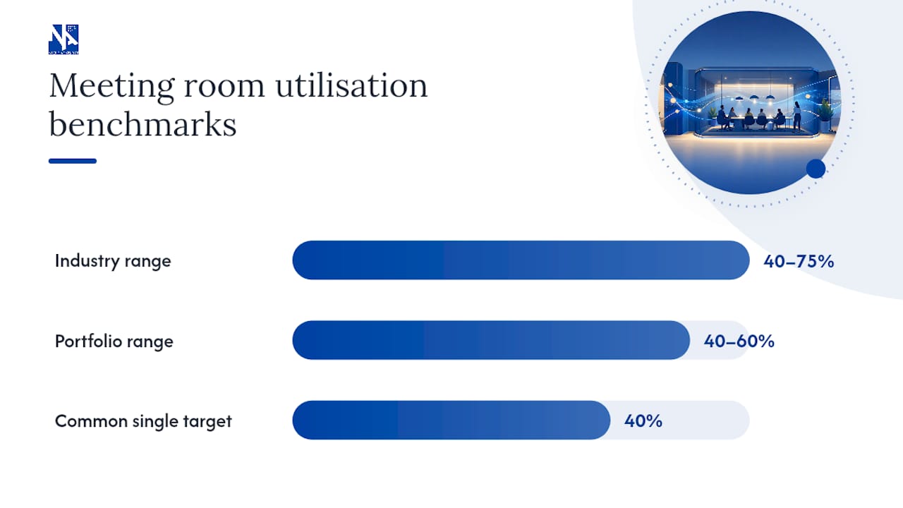
Meeting room utilisation benchmark: industry guidance commonly places target utilisation somewhere between 40% and 75%, depending on room size and portfolio context, with roughly 40 to 60% often cited as a reasonable portfolio‑wide target.
Room‑size match and no‑show rate are the two metrics most directly tied to real estate savings, because they point straight at wasted square metres rather than just busy calendars.
How do you actually measure room usage?
Booking data, check‑ins, and occupancy sensors each answer a different question, and no single source gives you the full picture on its own.
Calendar data is the easiest to pull and the least reliable on its own. It tells you what was booked and by whom, but nothing about whether the meeting happened, ran short, or hosted three people in a room built for twelve. Microsoft’s room analytics documentation treats calendar data as the starting layer, not the final word, and pairs it with auto‑release and check‑in features to verify actual use.
Check‑in systems close part of that gap. A booking that isn’t confirmed within a grace period, commonly five to ten minutes, gets automatically released back into the pool. That single feature recovers hours of “phantom booked” time every week in most offices.
Occupancy sensors add the layer neither of the above can provide: actual headcount and presence, independent of what anyone typed into a calendar invite. Passive infrared and desk‑level counters are generally accurate for presence detection but weaker at precise headcounts in larger rooms.
- Booking data shows intent, not reality.
- Check‑ins confirm a meeting started, not how many people attended.
- Sensors confirm presence and rough headcount, but need calibration against known capacity.
- Combining all three, then cross‑checking badge access data where available, gives the most defensible picture of true usage.
On privacy, anonymous presence counting is the safer default over camera‑based systems, and it’s worth telling staff exactly what’s being measured before rollout, not after.
Pro Tip: Run booking data and sensor data side by side for two weeks before you trust either one. If they disagree by more than 15 to 20 percentage points on the same room, something’s wrong with your grace‑period settings or sensor placement, not your booking policy.
What good utilisation actually looks like
Target ranges shift with room size, and treating every room against the same number is where most benchmarking exercises go wrong.
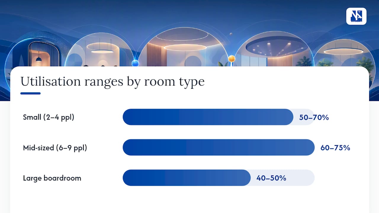
Small rooms built for two to four people tend to run hottest, often landing between 50% and 70% utilisation because they’re flexible enough for quick calls and impromptu catch‑ups. Mid‑sized rooms, seating six to nine, typically sit around 60% to 75% when they’re working well. Large boardrooms are the outlier: even in healthy offices they often average only 40% to 50%, and industry benchmarking commonly cites a 40 to 75% range depending on room type rather than one flat figure across the portfolio.
The mismatch problem in numbers: mid‑sized rooms built for six to nine people typically average fewer than half their capacity in occupants per meeting, a gap that shows up in almost every portfolio audit run over the past year.
Use peak and average together, not one or the other. “Improve room usage” isn’t.
What the numbers are usually trying to tell you
Once you’ve got a month or two of combined booking and sensor data, three patterns show up in almost every office, and each one points to a different fix.
- Ghost meetings and no‑shows. Recurring bookings that nobody cancels when the project ends are the biggest single source of waste, and comparing booking data against occupancy typically reveals that 20 to 40% of booked room hours in hybrid offices go unused.
- Room‑size mismatch. Boardrooms built for twelve regularly host meetings of three or four, a pattern visible the moment you overlay average attendee counts against stated capacity.
- Peak concentration. Demand often clusters hard between 10am and 3pm on Tuesdays to Thursdays, meaning the “shortage” some offices report is really a scheduling problem, not a floor‑space problem.
Prioritise fixes by frequency multiplied by impact. A ghost booking pattern happening daily across six rooms outranks a one‑off oversized meeting, even if the oversized meeting looks more dramatic in a single report.
Fixing utilisation without adding a single square metre
Most utilisation gains come from policy and configuration changes, not from leasing more space. Work through these roughly in order.
- Turn on auto‑release and grace periods. A five to ten‑minute check‑in window, standard in platforms like Microsoft Places, frees up rooms held by no‑shows within minutes rather than hours.
- Cap recurring bookings. Require recurring series to be re‑confirmed monthly or automatically expire, which kills the “standing meeting nobody remembers to cancel” problem at the source.
- Add live availability screens outside rooms. These cut the walk‑the‑floor hunting behaviour that drives people to grab booked‑but‑empty rooms informally, which then throws off your booking data entirely.
- Publish simple reservation etiquette. Book only what you need, release early if a meeting ends early, and don’t book a twelve‑seat room for a three‑person call.
- Reconfigure the worst offenders. Where data shows a large room consistently hosting small groups, partitioning it into two or three smaller collaboration pods often unlocks utilisation gains without adding a single square metre of floor space.
- Add phone booths for single‑occupant use, since analytics consistently show single‑occupant and small‑group meetings dominate actual room demand far more than the meeting rooms were designed for.
Pro Tip: Fix the grace period and the recurring‑booking cap before you spend a dollar on sensors or reconfiguration. Those two policy changes alone tend to recover the largest single chunk of wasted room hours, and they cost nothing to switch on.
Assign ownership clearly: someone in facilities or workplace strategy needs to own the reporting cadence (monthly, at minimum) and the KPI targets, or the data collection effort quietly dies after the first quarter.
Running a pilot without overbuilding your tech stack
A phased rollout beats a big‑bang sensor deployment across every floor, and it gives you defensible data before you commit budget.
Phase 0, audit. Inventory every bookable room, its stated capacity, and current booking volume. Set one or two clear objectives, such as identifying the three worst‑performing rooms by size‑match.
Phase 1, pilot. Select a representative sample, ideally one small, one mid‑sized, and one large room, and run it for four to six weeks, cross‑checking bookings against sensor readings the whole time. Shorter pilots don’t capture enough of the peak‑and‑average pattern to be trustworthy.
Phase 2, scale. Roll integrations across calendar systems, sensors, and badge access where relevant, and put a live dashboard in front of the people who own the KPIs, not just IT.
Phase 3, govern. Lock in automated release rules, a monthly reporting cadence, and a clear escalation path when a room’s numbers drift outside target range.
Privacy has to run through every phase, not get bolted on at the end. Minimise personal data collection, favour anonymous presence counting over camera‑based systems, and communicate to staff exactly what’s being measured and why before sensors go live.
- Confirm calendar and sensor integration compatibility before signing any vendor contract.
- Ask for accuracy figures under real occupancy, not lab conditions.
- Check the privacy model, anonymous counting versus identifiable data, before hardware goes in a single room.
- Get a cost‑per‑room figure, not just a platform licence fee, to compare pilots fairly.
What a practitioner’s audit usually finds
Running audits across dozens of tenant fitouts, an experienced advisory firm applies the same sequence every time: audit, pilot, scale, govern. The pattern rarely changes much between industries. Boardrooms are almost always oversized for what they host day to day, recurring bookings pile up long after the project that created them has closed, and the biggest early win is usually right‑sizing combined with eliminating ghost bookings, not adding new floor space.
Adam and the Nicheadvisory team have run this playbook across corporate tenancies for more than 12 years, pairing utilisation data with space planning decisions so clients don’t reconfigure a floor based on a hunch. Benchmarking data and case studies from specific engagements are available on request through consultation.
Get expert help turning utilisation data into real savings
Running the audit is one thing. Turning what it reveals into a signed‑off floor plan, a lease renegotiation, or a fitout brief is a different job entirely, and some advisory firms offer this service daily. Where most utilisation software stops at a dashboard, Nicheadvisory pairs the data with independent advisory and hands‑on space planning that turns a 38% utilisation figure into an actual reconfigured floor, without pushing you toward a bigger lease as the default fix.
If your utilisation numbers already look shaky, or you’ve never actually measured them, the practical next step is a proper audit rather than another dashboard subscription. Start with Nicheadvisory’s office space calculator to sanity‑check your current footprint against real usage, then book a consultation through the Nicheadvisory site to scope a full audit and rollout plan.
Sources
FAQ
What are the etiquette rules for using a meeting room?
Book only what you actually need, release the room the moment plans change, and never hold a recurring slot beyond the project it was created for. Turning up within the check‑in grace period also matters, since most auto‑release systems will free the room after five to ten minutes if nobody arrives.
What are the benefits of improving meeting room utilisation?
Better utilisation cuts wasted real estate spend by exposing rooms that can be resized or repurposed, and it reduces the daily friction of staff struggling to find an available room. It also feeds directly into lease and fitout decisions, since right‑sizing underused large rooms is one of the clearest ways offices reclaim capacity without adding space.
What are the guidelines for using conference rooms fairly?
Match the room to the group size rather than booking the biggest available option out of habit, confirm attendance where check‑in is required, and cancel promptly if a meeting is no longer needed.
What’s a realistic first target for meeting room utilisation?
Aim for a specific, testable goal tied to one room type, rather than a vague “improve usage” target. Portfolio‑wide targets commonly sit between 40% and 75% depending on room size.
Do we need sensors, or is booking data enough?
Booking data alone consistently overstates real usage because it can’t detect no‑shows or undersized attendance, so pairing it with even basic occupancy sensors or check‑in confirmation gives a far more reliable picture before you make any space decision.