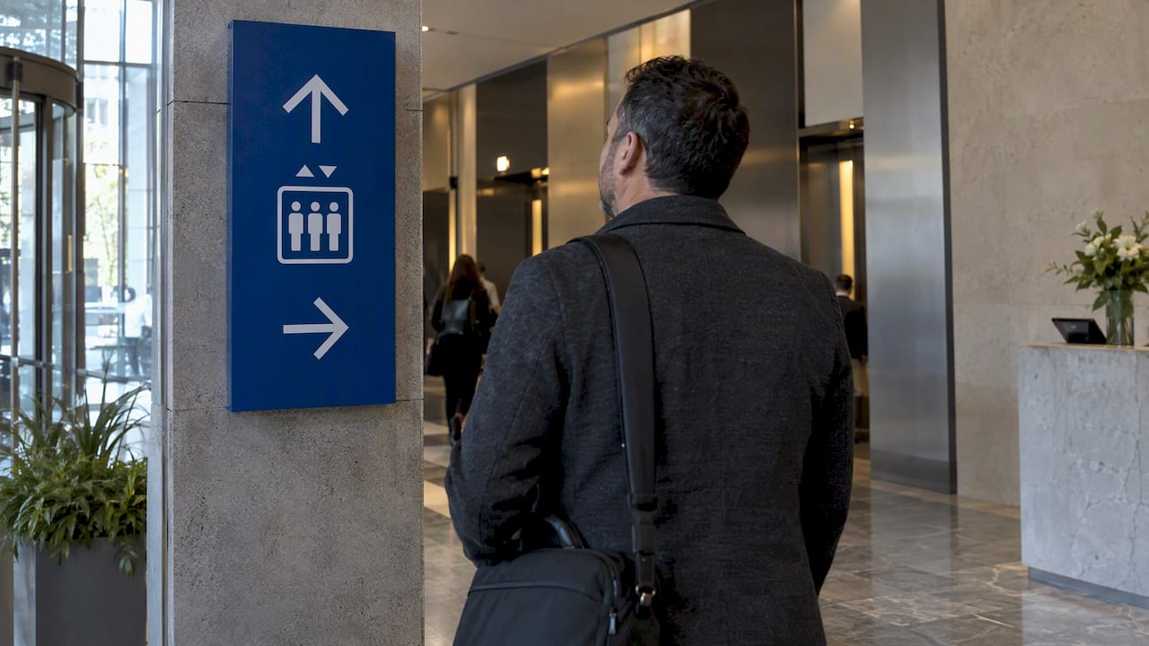
Good office wayfinding means a new starter, a visitor or a colleague who is in twice a week can get from the lift to the right desk, room or person without asking anyone. It is a system built from floor layout, graphics, signs and sometimes software. It is not a set of signs added in the last fortnight of a fitout. This guide covers the principles, the signage types, the accessibility rules that apply in Australia, and how to bring wayfinding into your workplace plan early, when it costs least.
TL;DR
- Treat wayfinding as a system: layout, graphics, signs and digital tools working together, not a signage order placed at the end of the project.
- Hybrid and activity-based offices need flexible wayfinding. Static desk labels fail when nobody has an assigned seat.
- Accessibility is a legal baseline in Australia (the NCC and AS 1428.1 for tactile signs) and also a way to reduce confusion for everyone.
- Plan the journey from the street, lobby and lift to the desk, and keep it consistent across every floor you lease.
- Decide wayfinding scope during workplace strategy and lease negotiation, so the cost sits in the budget and the make-good plan.
Table of Contents
- What office wayfinding actually covers
- Why it matters more in a hybrid office
- Wayfinding design principles that hold up
- Signage types and where each earns its place
- Accessibility and compliance in Australia
- Static signs, digital tools, or both
- A process that works for tenants
- Where wayfinding meets your lease
- Common mistakes
- How Niche Advisory can help
- FAQ
- Sources
What office wayfinding actually covers
Wayfinding is how people orient themselves in a space and move through it. The Department of Finance describes it in its inclusive design guidance for workplaces as a matter of orientation and navigation, and notes that effective systems reduce stress and cognitive load.
That definition is wider than signage. In a working office it includes:
- The architecture itself. Sightlines, a clear central circulation route, a visible reception, and landmarks such as a feature stair or a kitchen hub.
- Graphics and signs. Floor numbers, zone names, room names, directories, door plates and safety signs.
- Colour, materials and lighting. A change of flooring that marks a neighbourhood boundary, or lighting that draws people toward the main route.
- Digital tools. Interactive floor maps, desk and room booking screens, and apps that show where a colleague is sitting today.
- People and process. A reception team that gives the same directions the signs do, and visitor emails that describe the arrival route.
Most wayfinding problems we see in tenant offices come from treating only the second item as the job. A sign cannot fix a floorplate where the meeting rooms are hidden behind the kitchen.
Why it matters more in a hybrid office
In an office where everyone had a named desk, people learned the layout in a week and wayfinding mattered mostly to visitors. Hybrid work changes that. According to the Australian Bureau of Statistics, 36% of employed Australians usually worked from home in August 2025. Many staff now attend a few days a week, often on different days from their teammates, and they rarely build the same mental map of the office.
When seating is unassigned, three things happen:
- Desk labels become meaningless, so people need zone-level cues (a neighbourhood name, a colour, an icon) rather than seat numbers.
- Finding a colleague becomes a daily task. Without a directory or a people-finder, staff wander or send messages.
- Room and desk booking become part of navigation, because the sign on the door has to match what the booking system says.
This is also why hot-desking and activity-based layouts need a plan for movement from the start. We discuss the leasing side of this in our piece on the resurgence of hot-desking in Sydney offices, and the space-planning side in our guide to a flexible office strategy.
Wayfinding design principles that hold up
The principles below are consistent across the government and university guidance we reviewed and with how experienced signage consultants work.
Be consistent across floors
If level 3 labels its zones by colour and level 4 labels them by number, every trip between floors costs effort. Use one naming logic, one set of icons, one typeface and one placement rule for the whole tenancy. The Department of Finance’s universal design fact sheet describes simple and intuitive use as spaces that are predictable, consistent and easy to understand. That is a good test for any floor you are about to sign off.
Give information in layers
People need different things at different points. A clean hierarchy works well:
- Arrival: building and tenancy identification from the street, the lobby and the lift.
- Orientation: a directory or map at the lift lobby and the main junctions.
- Direction: zone and room signs at decision points, such as where a corridor splits.
- Identification: door plates, room names and booking status at the destination.
Do not put every piece of information everywhere. A sign with twelve destinations on it is read by nobody.
Use more than one sense
The Department of Finance advocates a hierarchy of information across visual, tactile and auditory channels, so that people with different sensory or cognitive needs can all perceive it. Neurodivergent staff, people with low vision and people who are simply new to the building all benefit from clear language, high contrast, simple icons and predictable placement.
Plan the whole journey
The journey starts before the front door. Where do staff and visitors come from: the train station, the car park, the ferry? Is your entry obvious from the street, and does the building’s own signage mention your company? A visitor who is lost in the lobby has already formed an impression. Include pre-arrival information, such as a visitor email with a photo of the entrance and the lift to take.
Name things plainly
Use the words your people use. “Collaboration Zone B” means little; “The Hub” or “Quiet Floor” is learned in a day. Keep room names short and avoid names that can be confused when spoken. Test names with someone who has never been in the office.
Signage types and where each earns its place
Searches for office signage design usually mean one of four things. Here is how they differ in purpose.
| Type | Purpose | Typical location | Notes |
|---|---|---|---|
| Identity and entry signs | Brand and tenancy recognition | Reception wall, tenancy door, building directory | Check what the landlord and building rules allow before design |
| Directories and maps | Orientation | Lift lobbies, main junctions | Keep to the key destinations, not every room |
| Directional signs | Route decisions | Corridor splits, open-plan junctions | Ceiling-hung or wall-mounted depending on sightlines |
| Room and door signs | Identification | Beside or on doors | Tactile versions where required, plus a booking screen if you use one |
| Floor and wall graphics | Zone cues and branding | Walls, floors, glazing | Frosting on glass also reduces collisions |
| Safety and statutory signs | Exits, fire equipment, first aid | As required | Not decorative, follow the relevant standards and your fire engineer |
A common mistake is to design the brand-led signs first and fit the functional ones around them. Do it the other way: map the decisions people make on the way through, then add brand expression where it does not hurt legibility.
Accessibility and compliance in Australia
This is the part of wayfinding that is not optional, and it is where tenants most often rely on assumptions.
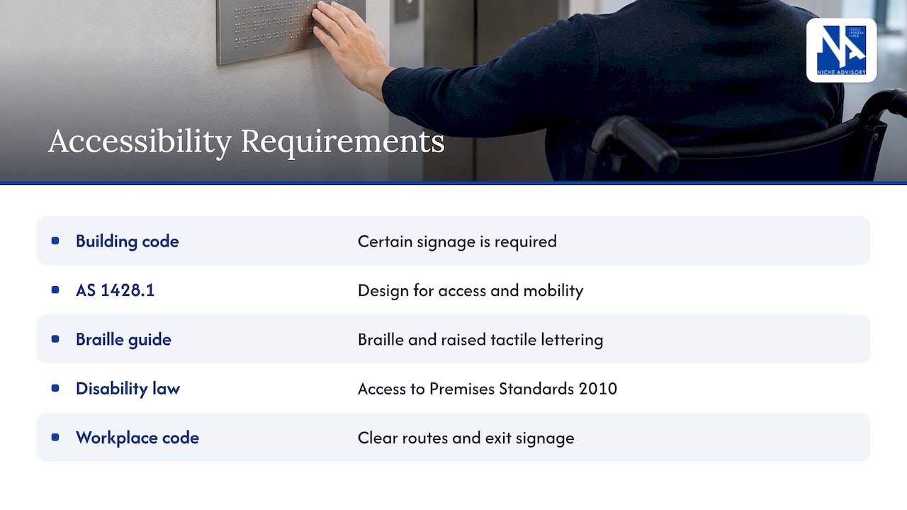
Building code and standards. The National Construction Code makes certain signage a building requirement and refers to AS 1428.1, Design for access and mobility. A signage industry guide summarises the requirements for Braille and raised tactile lettering on specified signs. Treat that guide as a starting point only. Which edition of the standard and which signs apply depends on the building classification and your contract, so confirm with your building certifier or access consultant before ordering anything.
Disability discrimination law. The Disability (Access to Premises – Buildings) Standards 2010 sit alongside the NCC. Meeting minimum code for new work does not guarantee that your existing tenancy is usable by everyone, so an access review of the current fitout is worth the modest cost.
Government guidance you can borrow. The Department of Finance has published a Property Accessibility Assessment Tool, a practical checklist of workplace design features that helps identify barriers. It was written for government entities, but the checklist is a sensible way for any tenant to audit wayfinding. NSW has an Accessible Office Design guide that sets out a performance framework for new and existing buildings. South Australia’s accessible wayfinding and signage toolkit was developed for state authorities with a focus on people who are deaf, hard of hearing, blind or vision impaired, and it is a useful reference outside government too.
A building accessibility guide. The Department of Finance also explains how to create a Building Accessibility Guide, which can record where signage is, what it shows and what type it is. It is useful for staff as well as visitors: an internal page showing accessible routes, quiet rooms and adjustable workstations does a lot of quiet work.
Workplace safety. Safe Work Australia’s model code of practice on managing the work environment and facilities covers the duties of those who control a workplace, including for office environments. State and territory regulators adopt codes in their own form, so check the version that applies to you. Clear routes and exit signage are part of that picture.
For a deeper look at the tenant side, including how access obligations interact with your lease, see our guide to accessible office design for tenants.
Static signs, digital tools, or both
Static signs remain essential. They are required for compliance, they work when the power or network is down, and they do not need updating when someone moves desks. Digital wayfinding earns its keep where the answer changes daily.
Use static signs for:
- Statutory and safety information.
- Floor and zone identification.
- Room names and tactile door signs.
- Permanent directories of fixed destinations.
Consider digital for:
- Desk and room booking displays outside meeting rooms.
- Interactive floor maps and colleague finders in activity-based or hot-desking environments.
- Visitor check-in and host notification.
- Occupancy data that tells you which floors you are paying for and not using.
The Western Sydney University campus at 1 Parramatta Square is a local example of the blend. Its design team describes a system of zone icons, directory totems and interactive kiosks supporting an activity-based model. It is a campus rather than an office, but the logic of physical cues at the atrium and digital layers above them carries over.
A note on cost discipline: do not buy software before you know your seating model. Choose the layout and the policy first (assigned, shared, fully free-address), then decide what the digital layer has to do. Software that does not match how people actually work will sit unused.
A process that works for tenants
Here is the sequence we recommend for an office move, refit or consolidation.
- Define how people will work. Attendance patterns, team neighbourhoods, shared versus assigned seating. Wayfinding follows from this. Our workplace strategy work starts here.
- Review the building. Where do the lifts, stairs, entries and services sit? What does the landlord’s building signage allow? Which fixed elements limit your sightlines?
- Map the journeys. List the main trips: visitor to reception, new starter to desk, staff member to meeting room, someone with a mobility aid to the accessible bathroom, emergency exit routes. Mark every decision point.
- Set the system. Zone names, colours, icons, typeface, mounting heights, sign families and the digital layer, if any. Have an accessibility specialist review it.
- Build it into design and documentation. Signage drawings and a schedule belong in the fitout documents, so the builder prices them and the program includes them.
- Test before opening. Ask someone unfamiliar with the office to find five destinations with no help. Watch where they hesitate, then fix those spots.
- Maintain it. Update directories after moves, and keep the naming rules in a one-page standard so later changes stay consistent.
Steps three and four are cheap in the design phase and expensive once walls are up. That is the practical case for planning early. For the project delivery side, our guide to office fitout project management covers what to expect and who should be on the team, and our note on workplace change management covers how to help staff adopt new ways of moving and working.
Where wayfinding meets your lease
Tenants often miss the commercial side of signage. Three points are worth raising before you sign.
- Building and tenancy signage rights. Many leases limit where and how you can display your name, including in lobbies and on the building directory. Negotiate these rights in the lease, not after the keys are handed over.
- Landlord approvals. Fixing signs to base-building walls, glazing or ceilings usually needs consent. Build that approval time into your program.
- Make-good. If your lease requires you to remove fixed signage and repair the surfaces at the end of the term, that cost belongs in your fitout budget from day one. Vinyl and freestanding systems are generally easier to reverse than routed or bonded fixings, but confirm what your lease says.
These are lease-specific questions, and the answers sit in your document. A tenant representative who acts only for tenants can read the clauses with you before commitment, which is the work our tenant advocacy team does.
Common mistakes
- Starting with signs, not journeys. The signs end up labelling a confusing layout instead of supporting a clear one.
- Per-floor improvisation. Each floor gets its own naming and icons, usually because they were fitted out in separate stages or by different teams.
- Desk numbers in a free-address office. Staff cannot use them, and visitors cannot either.
- Low contrast, small text, glossy finishes. Attractive in renders, hard to read under real lighting.
- No owner. Nobody is responsible for updating the directory or the booking display, so within six months the information is wrong.
- Ignoring the arrival. The lobby, the lift and the street entry are the first test, and often the least controlled.
How Niche Advisory can help
We act exclusively for tenants and owner-occupiers, never landlords. That matters here because wayfinding sits across decisions that rarely get made together: which building to lease, how the floorplate will be used, what the fitout includes and what you must reinstate at the end. Our team connects workplace strategy with design, project and construction management and lease negotiation, so wayfinding is scoped once and sits in the budget. If you operate in Sydney, Melbourne, Adelaide or another of our markets, start with a conversation through our Sydney tenant advisory page or the Niche Advisory home page.
FAQ
What is the difference between wayfinding and signage?
Signage is one tool within wayfinding. Wayfinding is the whole system that lets people orient themselves and move through a space, including layout, landmarks, lighting, graphics, digital tools and reception processes. A well-planned office can need fewer signs because the layout already explains itself.
Do Australian offices have to use Braille and tactile signs?
The NCC requires tactile signage on certain signs, and it refers to AS 1428.1 for the technical detail. Which signs apply depends on the building class and your project, and the edition of the standard can matter. Confirm the requirements with your building certifier or an accredited access consultant before you finalise the signage schedule.
How do you design wayfinding for a hot-desking or activity-based office?
Label zones and neighbourhoods rather than individual desks, and use consistent colours and icons across floors. Add a digital layer, such as a desk booking screen or colleague finder, only if your seating policy needs it. Test with people who are new to the space before you open.
When should wayfinding be planned in an office fitout?
During workplace strategy and concept design, not after construction documentation. At that point you can still change layouts, agree signage rights in the lease and put the cost in the fitout budget. Leaving it to the end usually means fewer options and a rushed order.
Who is responsible for wayfinding in a leased office?
In most cases the tenant, within the limits of the lease and the landlord’s approvals. Base-building signs in lobbies and lifts belong to the building owner, but your tenancy signs, internal system and accessibility within your premises are your decisions. Check your lease for consent and make-good clauses.
Sources
- Property Accessibility Assessment Tool: inclusive design considerations (Department of Finance)
- Universal design in the workplace fact sheet (Department of Finance)
- Property Accessibility Assessment Tool (Department of Finance)
- How to create a Building Accessibility Guide (Department of Finance)
- Working arrangements, August 2025 (Australian Bureau of Statistics)
- Accessible Office Design (NSW Government)
- Accessible Wayfinding and Signage Toolkit (Inclusive SA)
- Managing the work environment and facilities, model code of practice (Safe Work Australia)
- Braille & Tactile Signs Explained (Signage4Business)
- Western Sydney University digital wayfinding and signage design